The Pantone Color of the Year is more than just a shade; it's a reflection of the cultural zeitgeist, influencing everything from fashion to interior design. Each year, the Pantone Color Institute carefully selects a color that embodies the mood of the moment, acting as a barometer of global trends and sentiments. In this article, we will explore the significance of the Pantone Color of the Year, its impact on various industries, and what it reveals about where we are as a society.
Understanding the Pantone Color of the Year requires a look into its history and methodology. Since 2000, Pantone has been announcing a color that they believe represents the spirit of the times. This decision is not made lightly; it involves extensive research into trends in various sectors, including fashion, art, and technology. The chosen color resonates with a collective experience and often serves as a source of inspiration for creators and consumers alike.
In the following sections, we will break down the implications of the Pantone Color of the Year, examine past selections, and discuss how these colors shape trends across different domains. Whether you're a designer, marketer, or simply a color enthusiast, this article will provide valuable insights into the power of color in our lives.
Table of Contents
- History of the Pantone Color of the Year
- Methodology Behind the Selection
- Impact on Fashion and Design
- The Psychology of Color
- Current Trends Influenced by the Color of the Year
- The Future of the Pantone Color of the Year
- Case Studies: Successful Implementations
- Conclusion
History of the Pantone Color of the Year
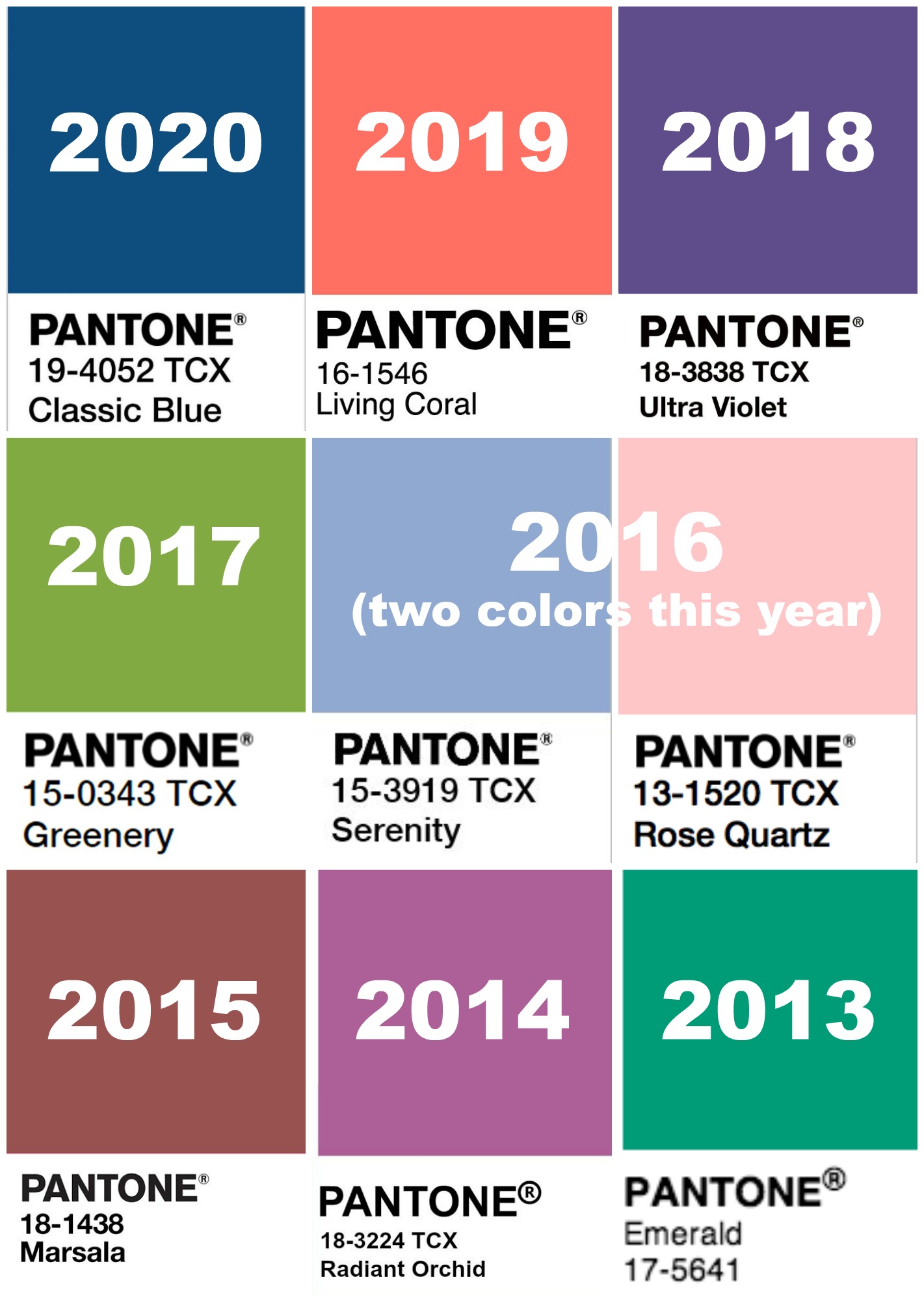
The concept of the Pantone Color of the Year was introduced in 2000. This annual tradition began as a way for the Pantone Color Institute to highlight the importance of color in design, marketing, and branding. Over the years, the selected colors have reflected a wide array of sentiments, from hope and optimism to tranquility and caution. For example, the selection of "Living Coral" in 2019 was seen as a celebration of life, while the deep blues and greens selected during more tumultuous years offered a sense of calm and stability.
Methodology Behind the Selection
The process of selecting the Pantone Color of the Year involves a comprehensive and meticulous approach. The Pantone Color Institute conducts an in-depth analysis of global trends, considering influences from various fields such as fashion, art, technology, and socio-political movements. The team travels the world to observe color trends in different cultures and industries.
Some key steps in the selection process include:
- Observation of color trends in various industries.
- Research into cultural movements and social issues.
- Analysis of consumer behavior and preferences.
- Collaboration with designers and brands for feedback.
Impact on Fashion and Design
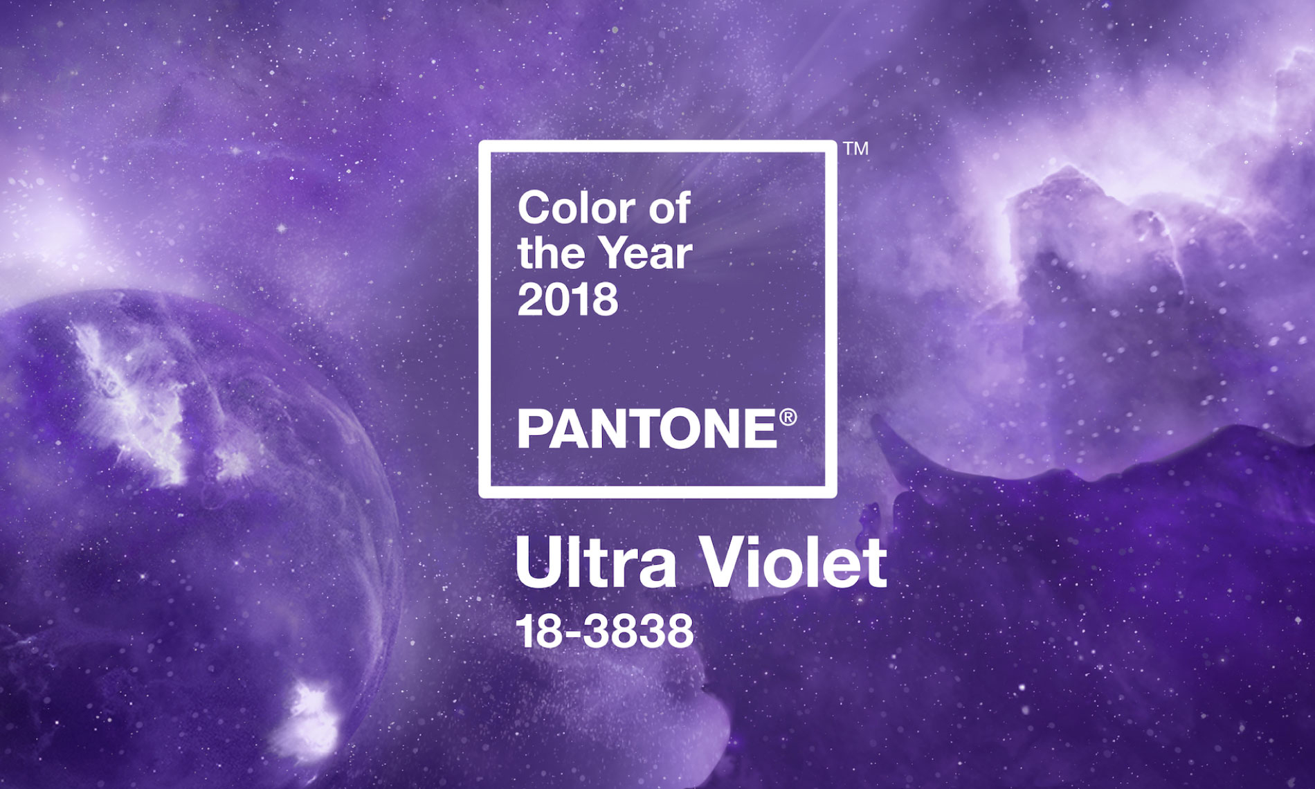
The Pantone Color of the Year significantly influences the fashion and design industries. Designers often incorporate the selected color into their collections, leading to a ripple effect throughout the market. For example, when "Ultra Violet" was chosen in 2018, we saw a surge in purple hues in clothing, accessories, and home decor.
Additionally, brands leverage the Pantone Color of the Year in their marketing strategies to align with current trends and consumer sentiments. This alignment can enhance brand perception and increase engagement with customers.
Fashion Industry Response
The fashion industry is one of the most responsive to the Pantone Color of the Year. Designers and brands often showcase the selected color in their runway shows, leading to widespread adoption in retail. The color influences everything from fabrics to accessories, and it often sets the tone for the upcoming seasons.
Interior Design Trends
In interior design, the Pantone Color of the Year can dictate color palettes for home decor and furnishings. Designers and homeowners alike use the color to create cohesive and trendy spaces. For instance, the incorporation of "Classic Blue" in 2020 inspired many to use this calming hue in various aspects of home design.
The Psychology of Color
Colors evoke emotions and can significantly influence our mood and behavior. The selection of the Pantone Color of the Year is often tied to the psychological impact of the color. For example, warm colors like reds and oranges can create feelings of excitement and energy, while cooler colors like blues and greens are associated with tranquility and calmness.
Understanding color psychology can help businesses and individuals make informed choices about branding, marketing, and personal style. Here are some common associations with colors:
- Red: Passion, energy, urgency.
- Blue: Trust, calmness, professionalism.
- Green: Growth, harmony, freshness.
- Yellow: Optimism, warmth, creativity.
Current Trends Influenced by the Color of the Year
The Pantone Color of the Year often sets the tone for emerging trends across various industries. In recent years, we've seen several trends influenced by these color selections. For example:
- Increased use of sustainable materials in fashion and design.
- Greater emphasis on mental health and wellbeing in branding.
- Adoption of bold and vibrant colors in technology products.
The Future of the Pantone Color of the Year
As we look to the future, the significance of the Pantone Color of the Year is likely to grow. In a world that is increasingly driven by visual communication, color will continue to play a crucial role in branding, marketing, and design. The ability of color to convey messages and evoke emotions makes it an essential tool for businesses and creators.
Case Studies: Successful Implementations
Several brands have successfully leveraged the Pantone Color of the Year to enhance their marketing and product offerings. For instance:
- Benjamin Moore: The paint company often aligns its marketing campaigns with the Pantone Color of the Year, resulting in increased sales and brand recognition.
- Fashion Brands: Leading fashion labels have incorporated the color into their seasonal collections, creating buzz around their products and driving consumer interest.
Conclusion
The Pantone Color of the Year is more than just a trend; it encapsulates the spirit of the times and influences various industries. Understanding its significance can provide valuable insights for designers, marketers, and consumers alike. As we move forward, paying attention to these color trends can help us make informed decisions in our personal and professional lives.
We invite you to share your thoughts on the Pantone Color of the Year! What are your favorite colors, and how do they influence your choices? Feel free to leave a comment below or share this article with friends and colleagues who might find it interesting.
Thank you for reading, and we hope to see you back here for more engaging content on design, color, and trends!